
12 min read Arnaud Joubay
4.0 - iCloud meets iOS 15
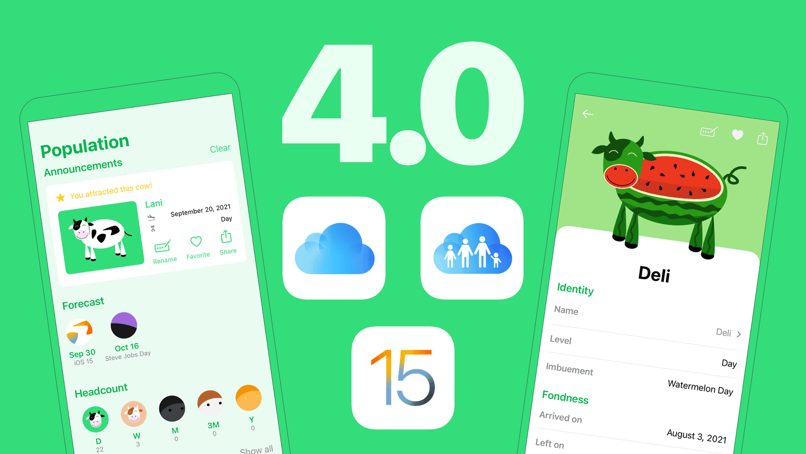
This update is packed with new features and improvements:
- Two special cows to celebrate iOS15 + Apple-related daily messages
- iCloud sync: this took a LOT of work and prepares for exciting updates
- Support for Family Sharing, including for existing subscribers! It’s time to invite your whole family on board!
- The Population view entirely redesigned: announcements of arrival & departures of cows, new forecast, a headcount to quickly know how many cows you have, each cow get their own color, nicer profile for each cow
- The Settings view was entirely redesigned
- iOS 15: notifications support the new interruption level (only the daily question is time-sensitive)
- iOS 15: nice icons for the notification answers
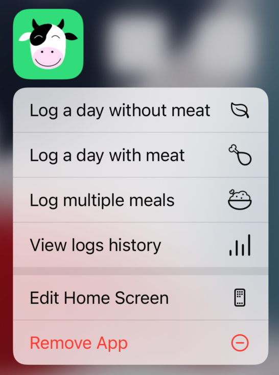
- Home Screen Quick Action: you can now answer from a long press on the Home Screen app icon
- And more…
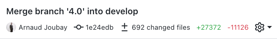
It was a lot of work, Perhaps this can give you an idea of the order of magnitude of the changes. The green/red is the number of lines added/removed.
Let’s break it down:
iOS 15 Event
This is actually the last thing I added. I wasn’t sure if it would be part of a 3.x update or if I would be ready to ship it along with the 4.0 update.
I wanted to celebrate iOS 15 and encourage users to update their devices. I used the 15 since its very first beta, so I felt comfortable doing so.
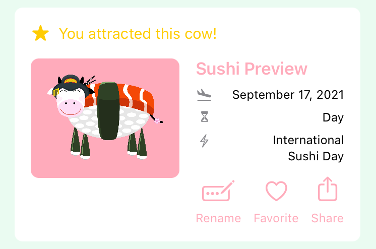
I created a special Fifteen cow inspired by the iOS 15 logo and refreshed the Steve Jobs cow. You can get these cows on Sep 30 and Oct 16.
I also added some Apple-related daily messages, the ones that appear with the daily question, such as “Eat different” or “1.000 cows in your pocket. Or more.”, and you can discover the rest by using the app!


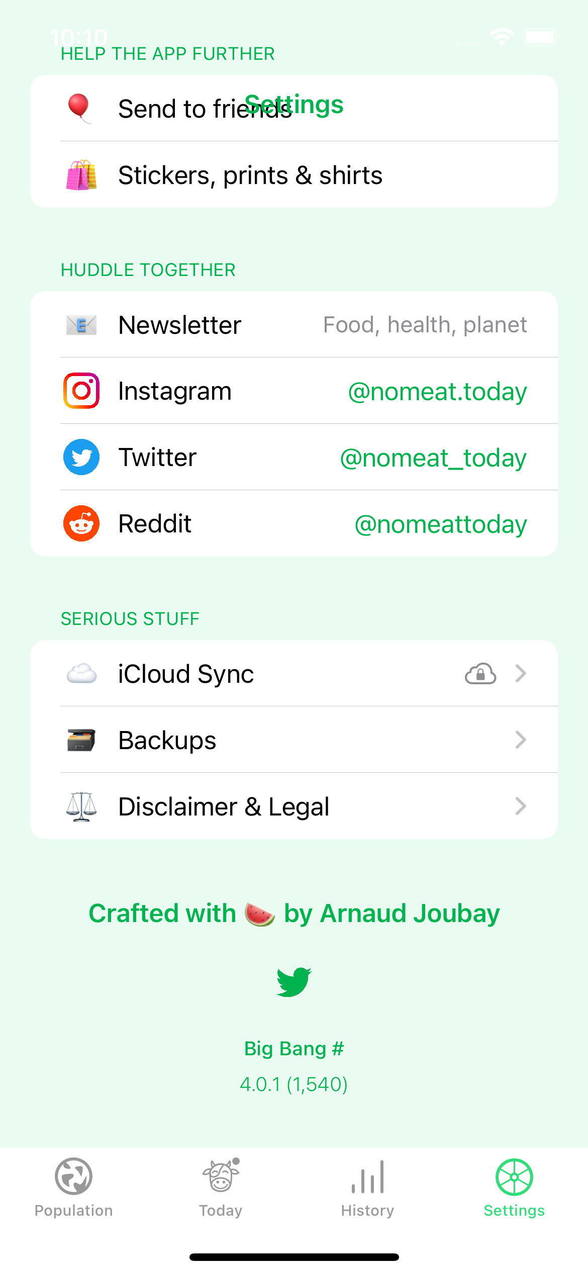
iCloud Sync
This update is the result of months of work. I need to write article(s…) about that because it was quite challenging.
If you know this meme, that’s exactly what my first semester of 2021 looked like.
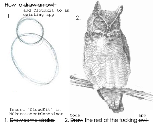
A lot of the app’s logic wasn’t ready for distributed storage, so I had to redesign my data model while making sure existing user data would be sent to the cloud (because, believe it or not, it’s not automatic).
I also ended up creating a whole new migration process: step-by-step lightweight migration, which is based on the step-by-step migration that’s been covered by many articles but using only lightweight migrations.
I spent a lot of time considering whether I should allow users to disable iCloud sync from the app or not. The SDK doesn’t make that easy, and there’s a good reason for that: they don’t want you to. I was surprised at first but it totally makes sense: if you have an iCloud account, you just expect your apps to use it to persist your data, this is not something you’ll want to play with.
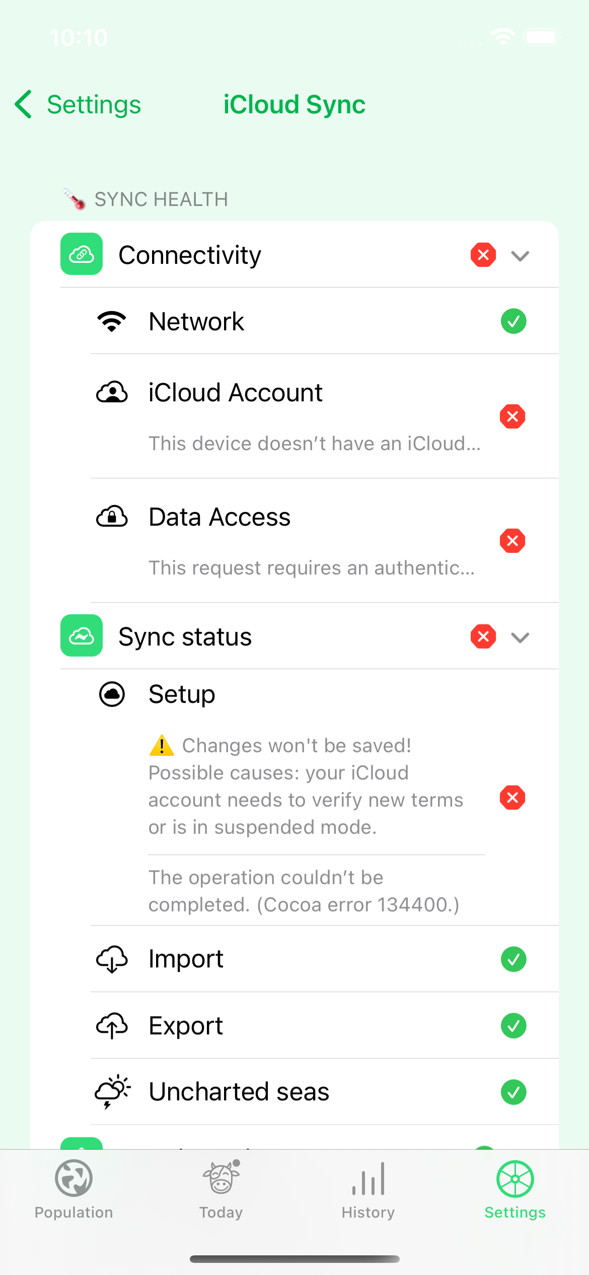
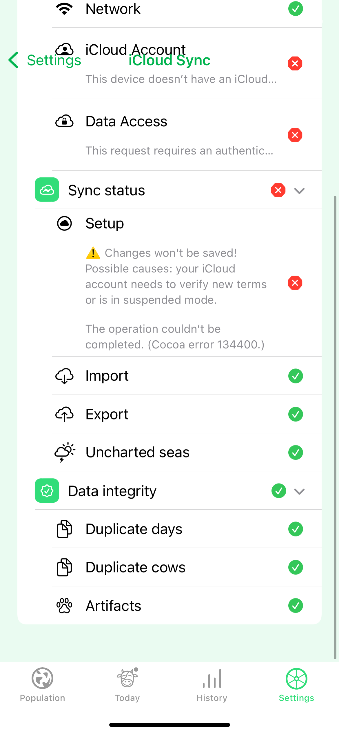
I’ve heard so many bad things about iCloud sync that I ended up creating a troubleshooting view, inspired by Crouton.app and others. This is something that only appears when a sync issue is detected, and I sincerely hope no one will ever get to see it.
Because I’m so paranoid about users losing their data, I did the following:
- before migrating the database, a backup of the store is made
- but also a JSON backup of the data
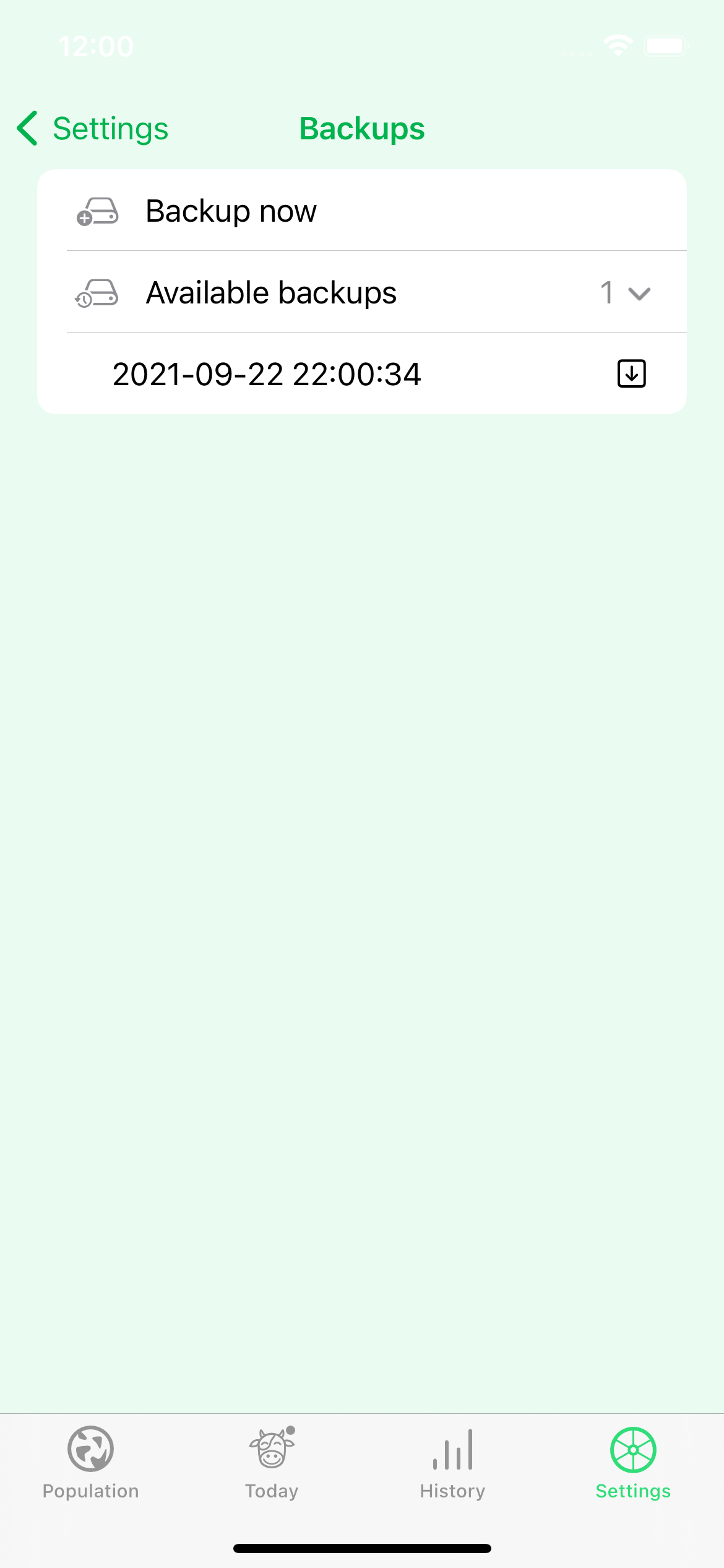
- I created a backup view where you can create and download as many JSON backups as you please
- I created tests suits to migrate from various versions of the store up to the latest one
It took a lot of work, but it was definitely worth it.
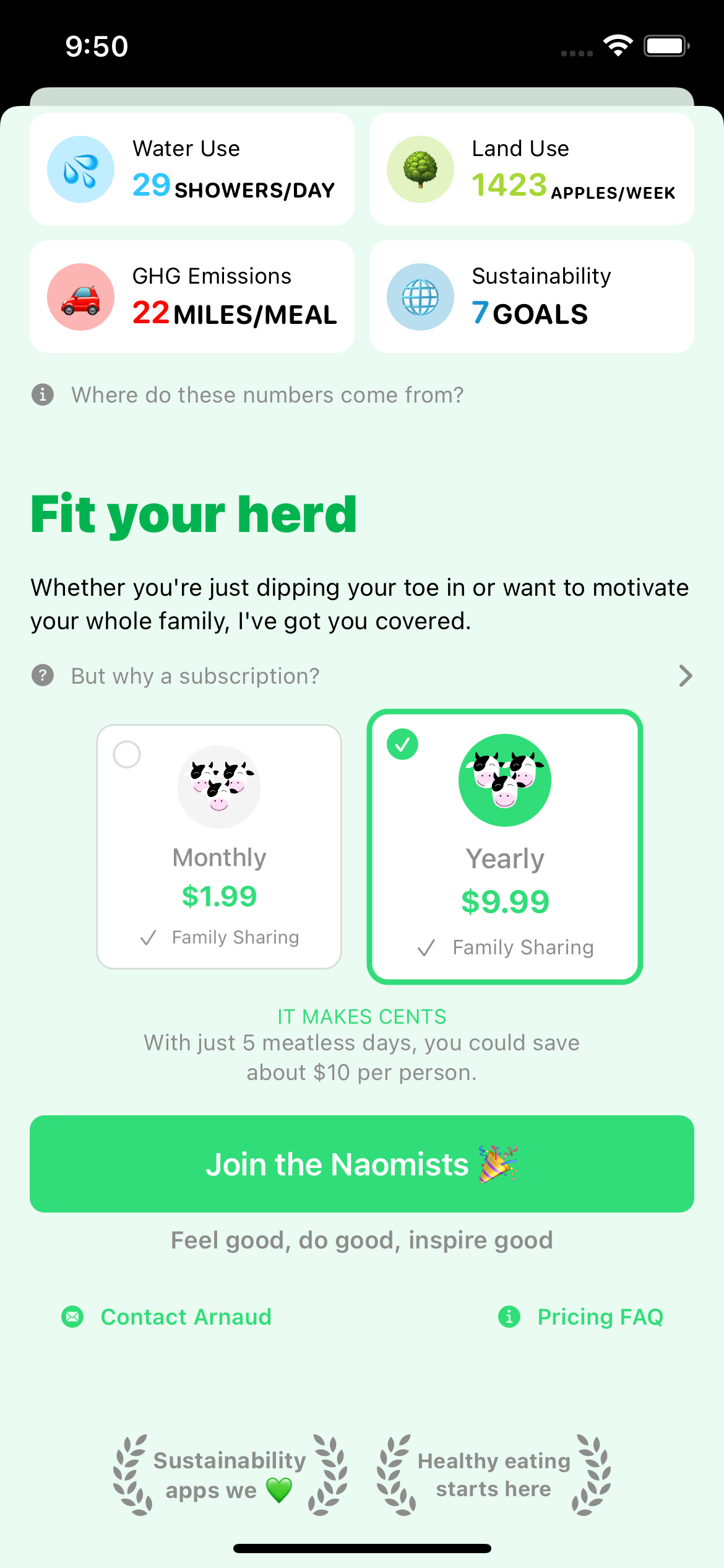
Family Sharing
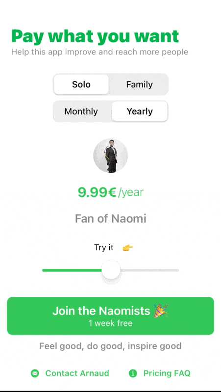
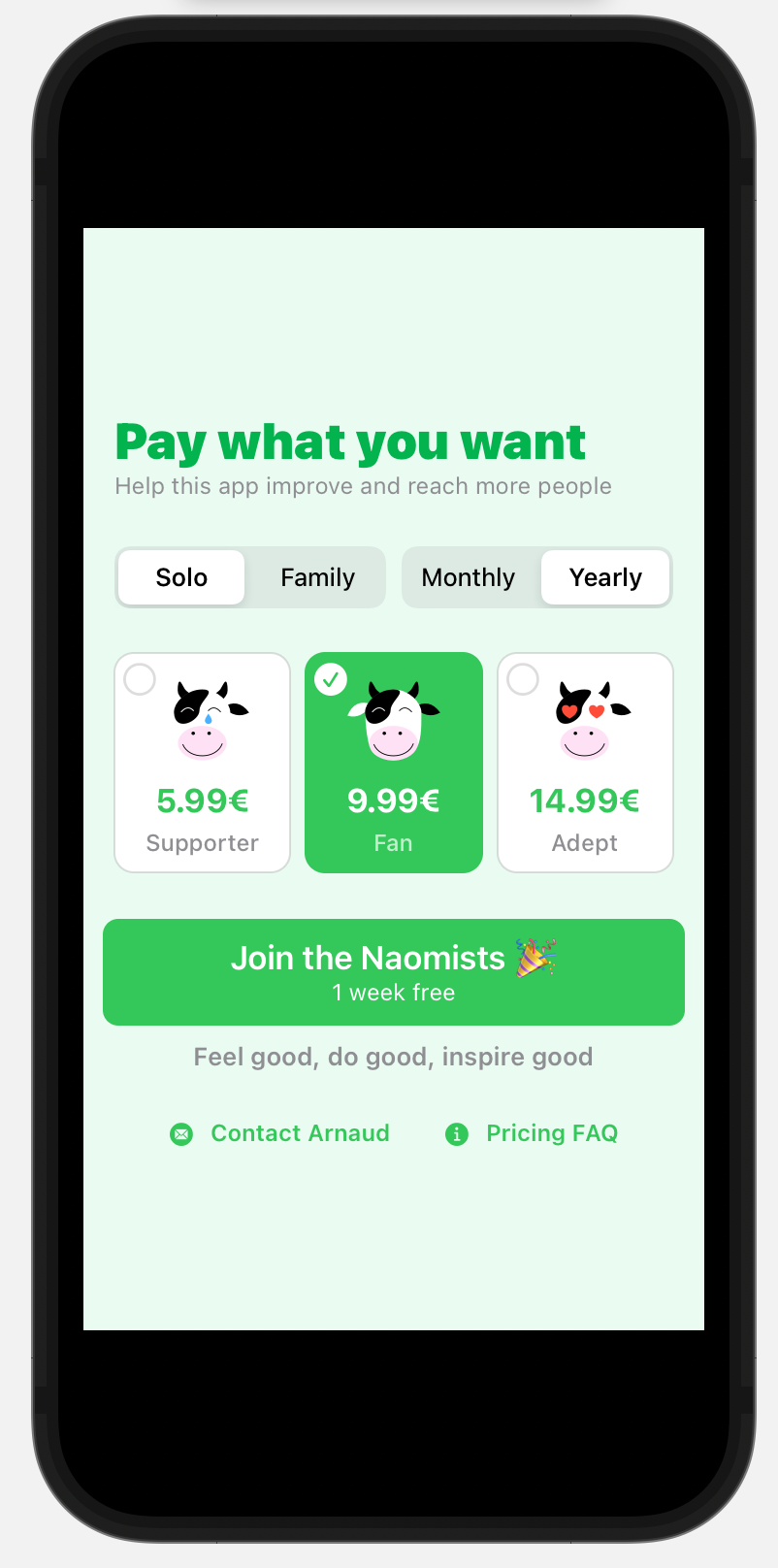
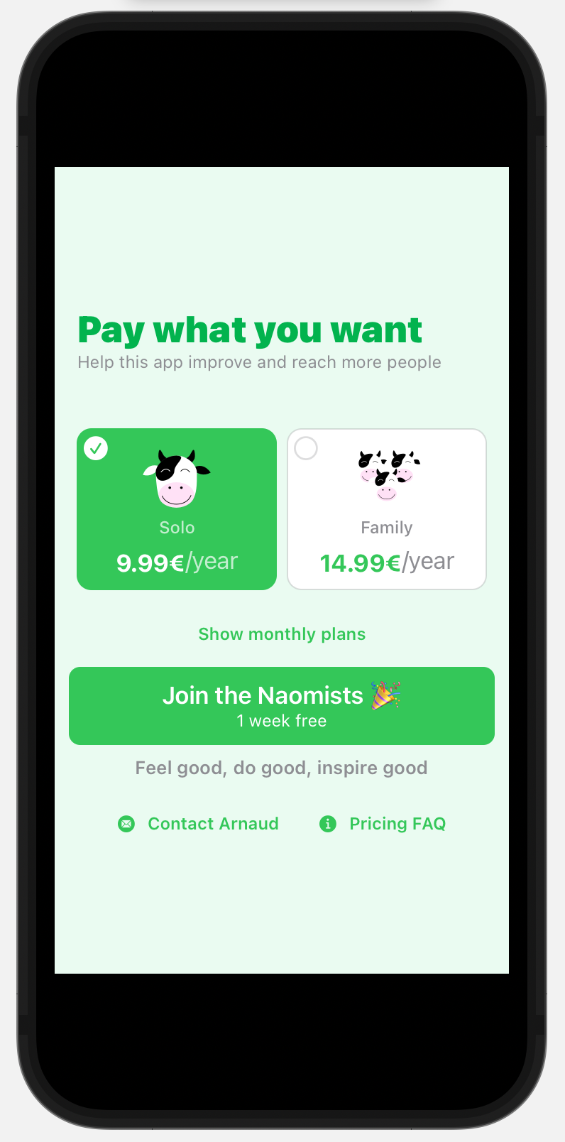
At first, I wasn’t sure what to do with this. I agonized over the decision and built a thousand (ok, tens, but it felt like a thousand) iterations of the pricing page to let users pick whether they wanted.
I couldn’t find the right design or the right way to approach the pricing, which led me to consider offering up to 12 price points. I pasted some ideas I tested below if you want to have a laugh at my expense. 🤣
In the end, I decided that all my subscriptions should have Family Sharing enabled. It just felt right, since this is the kind of journey that is easier to bring your whole family when you embark on this journey instead of doing it alone.
As for the pricing, I dropped the “pay what you want” (seen in the drafts below). While the idea is interesting, the reality is that I was putting the burden of choice on the users instead of making the hard decision, and this also contributed to the complexity of the interface.
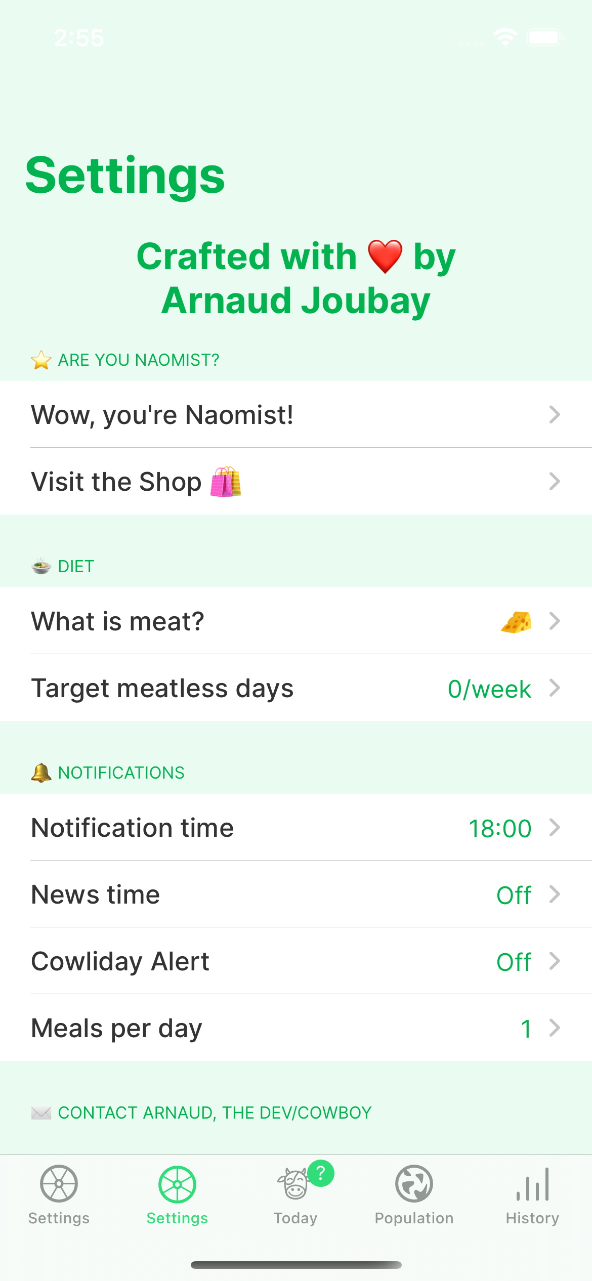
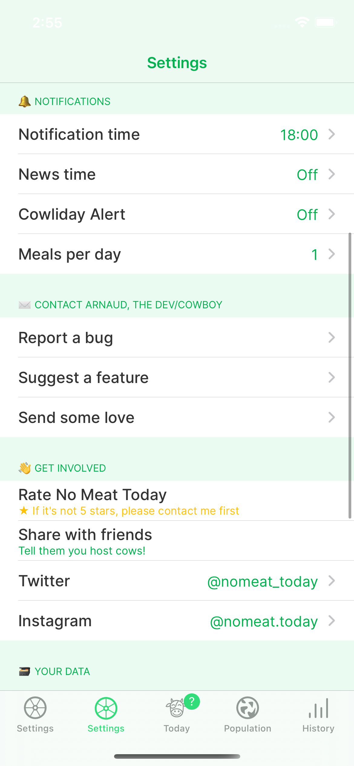
Settings redesign
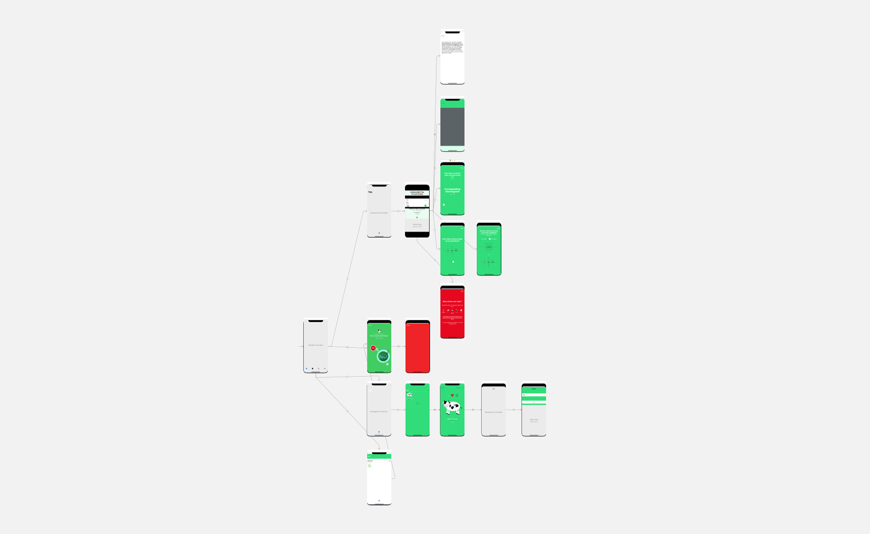
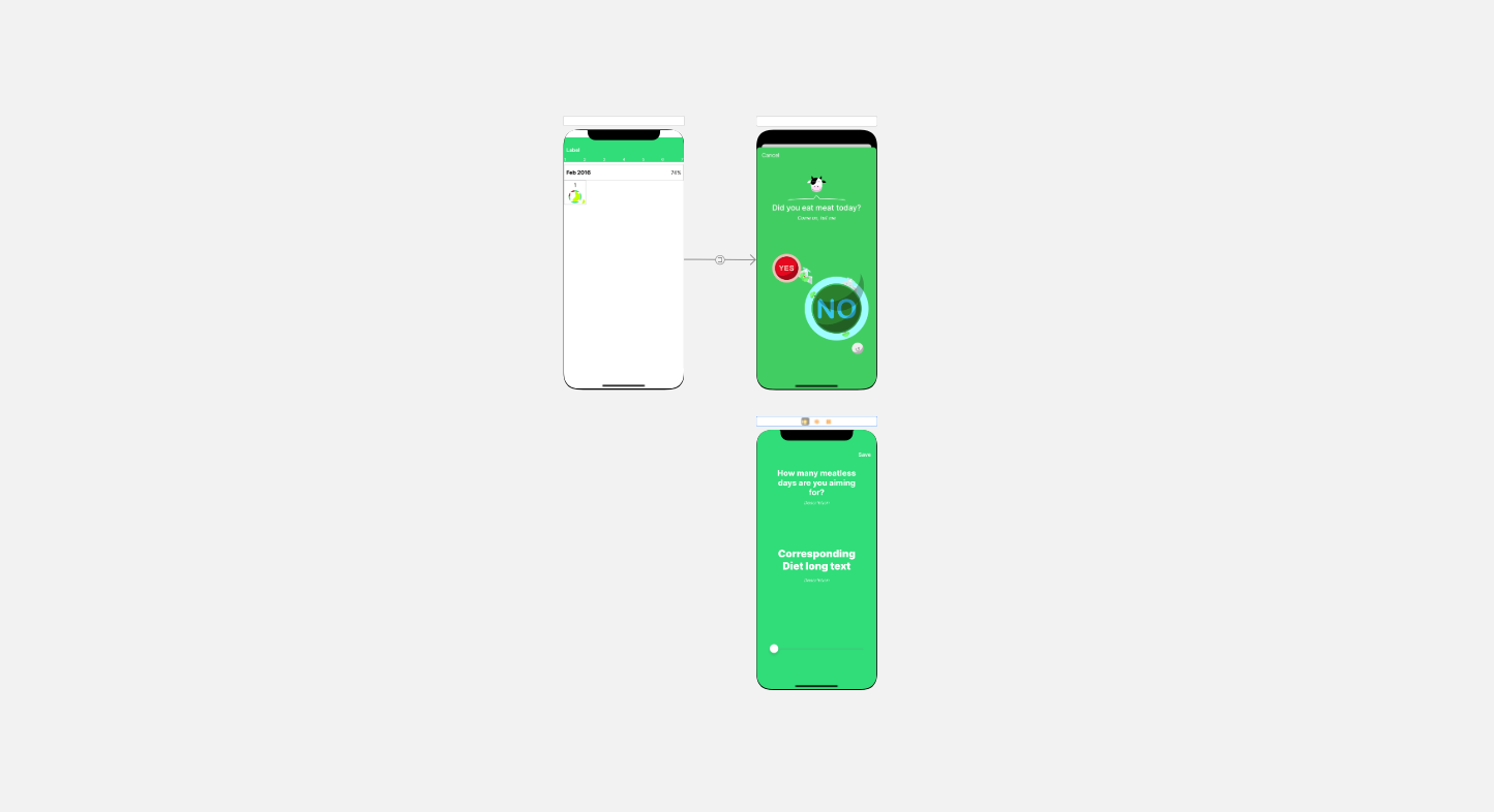
This is where I picked up the SwiftUI bug. I had decided that any significant change to any view would be done in SwiftUI, and since I needed to add new sections to handle iCloud sync (yes, the ones I hope you never have to see), I decided it was time to refresh the entire thing.
As you can tell from the screenshots of the UIKit storyboards below, the amount of non-SwiftUI views melted like glaciers in the 21st century.
The settings went from this
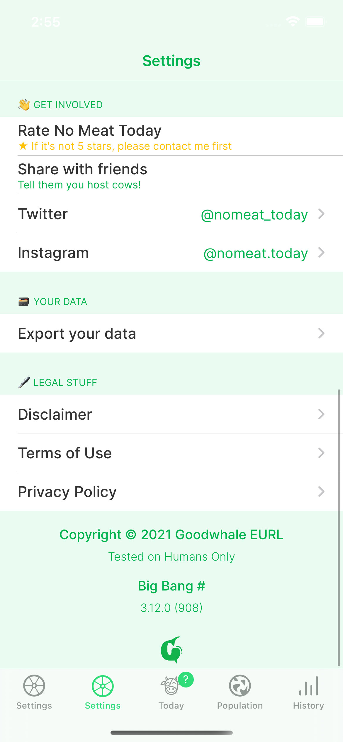
To this
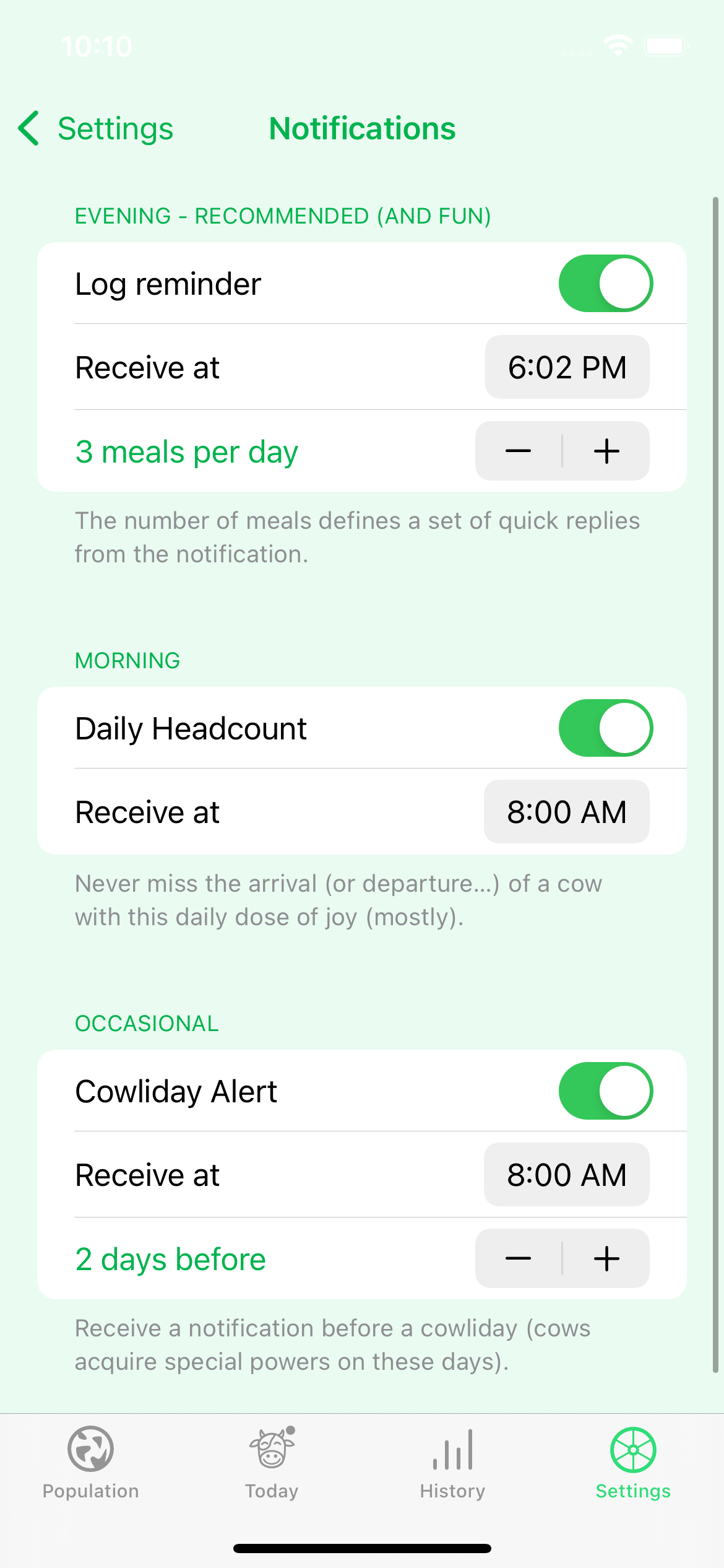
It’s not that big of a change, except for 4 things:
- it’s all SwiftUI, which prepares for what’s coming
- the notifications settings: I replaced a bunch of weird modal views with this single view
- the presentation of the premium offer, aka the paywall
- the 🍉 changes according to the season (based on what I fancy most at that time of the year)
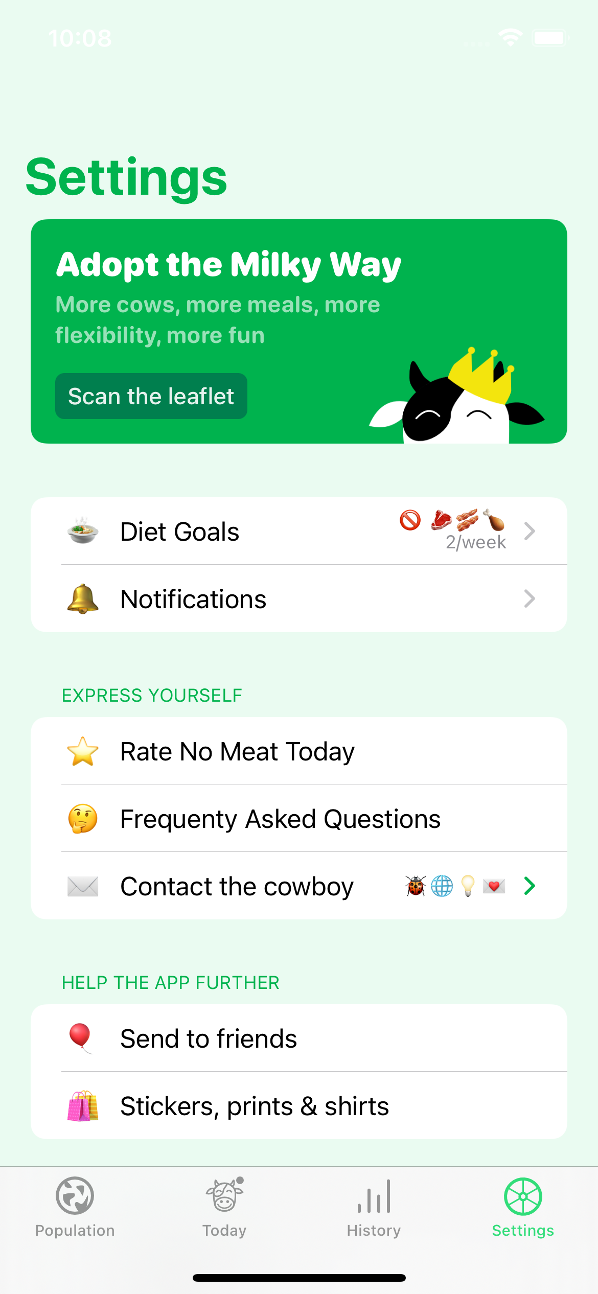
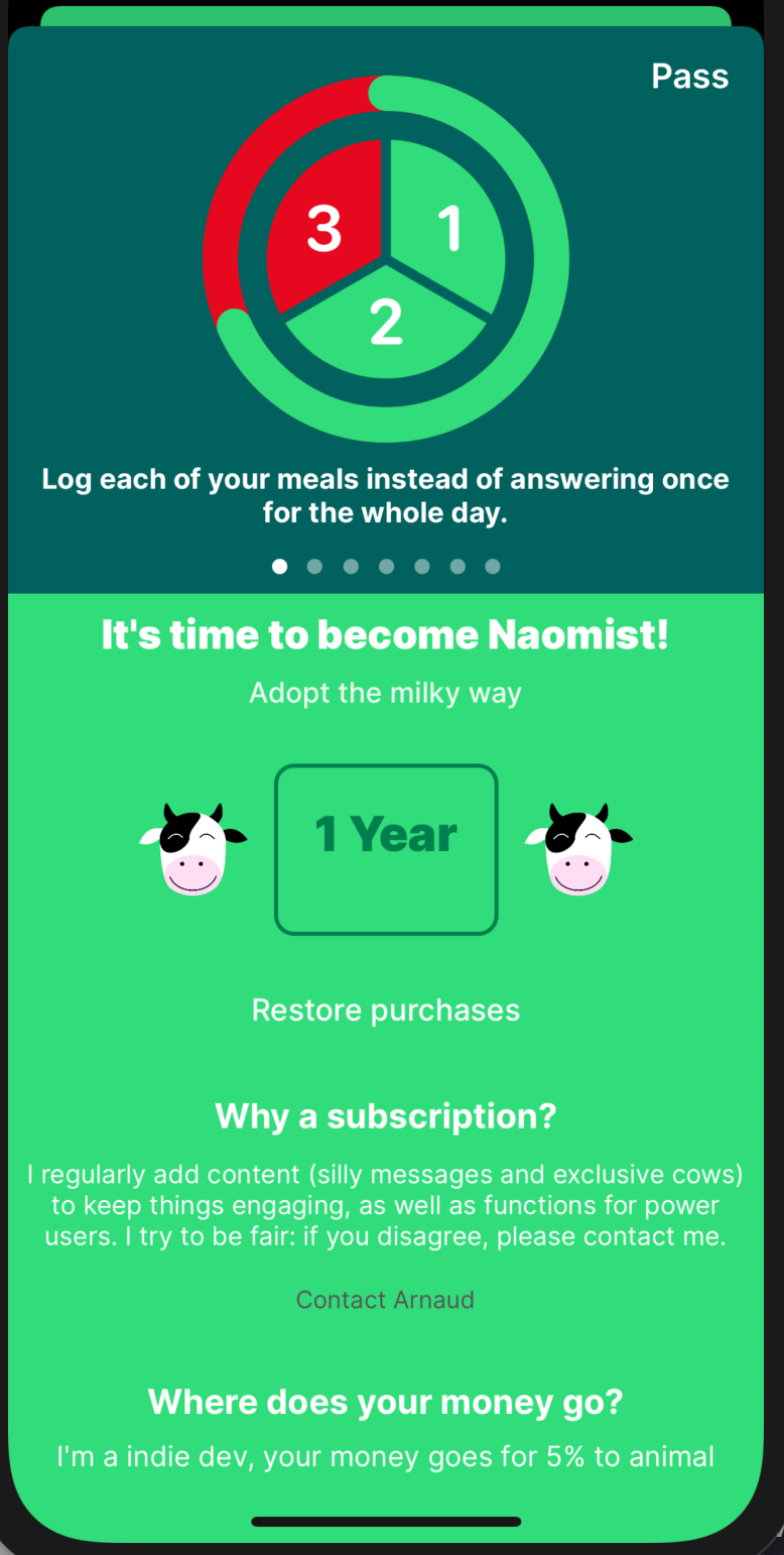
The Paywall
It’s part of the settings, and I think it deserves a focus mostly because of how bad it was pre-4.0.
It’s the last thing I added to the app, you can probably tell that I butchered it. People would sometimes contact me to remind them what exactly they were paying for.
Here’s a before/after
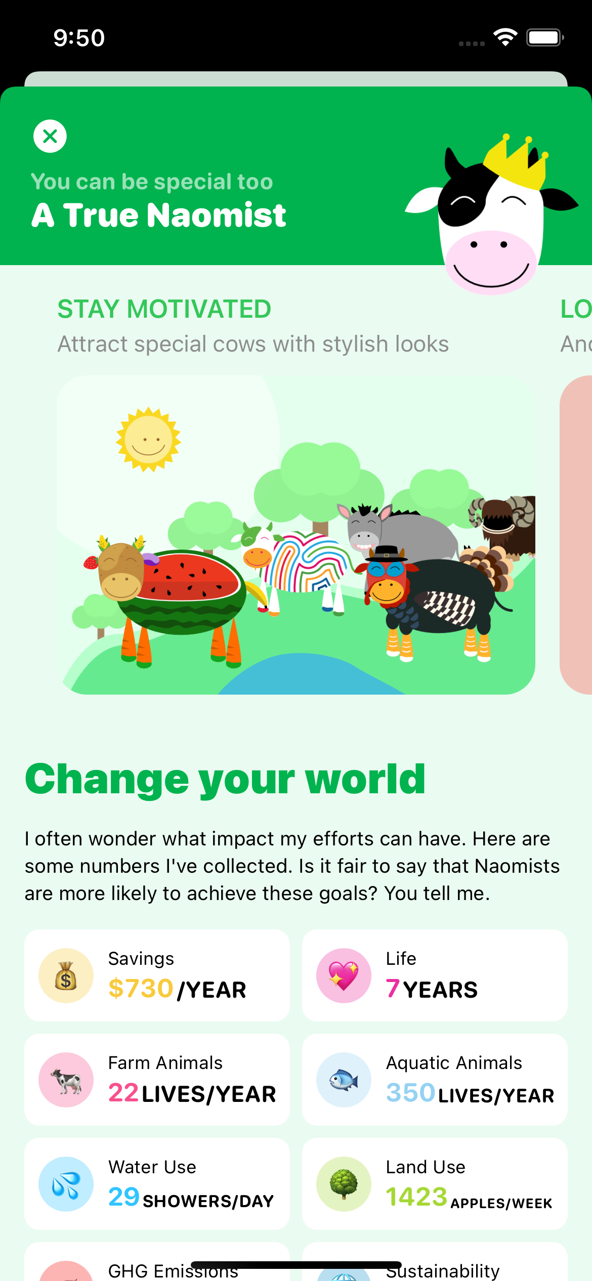
As you can see, I added a big section about the impact of a plant-based meal. This is without hesitation the second hardest thing I did for this update.
I spent months looking for data, research papers, trying to find some sort of consistency, and making peace with the idea that it was almost impossible to display figures that would accurately represent YOUR impact. At some point, I almost started to think about displaying different figures based on your country.
I explain where these figures come from in the FAQ, so you can fact-check everything if you want and see what it means for yourself. In any case, I am convinced that there are good reasons to eat less meat, and it doesn’t really matter what your precise impact is: it’s going in the right direction that matters.
Population redesign
This is a funny story actually. I had plans to update this view but it was not supposed to be part of this update, which was supposed to be about iCloud sync only.
But the thing is, the view controller would systematically crash when migrating the database. Upgrading an app and watching it crash wasn’t ideal from a user’s point of view, and the thing that caused it to crash would not even exist with SwiftUI.
Having redone the Settings entirely, I was excited to apply those new skills to a view that was more central to the user experience. And I was not excited at all to spend time fixing an annoying bug just to keep a design I couldn’t stand anymore.
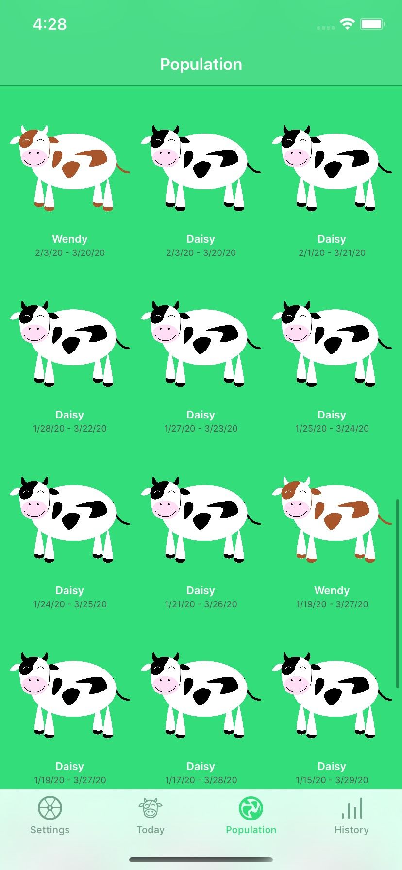
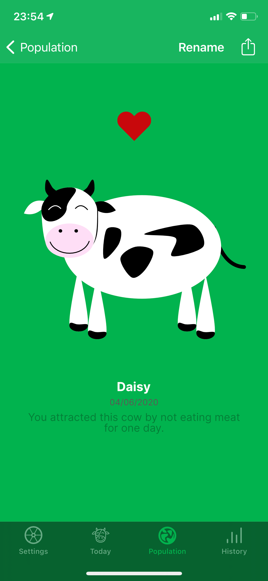
This is what the Population view was looking like.
And this is what it looks like now
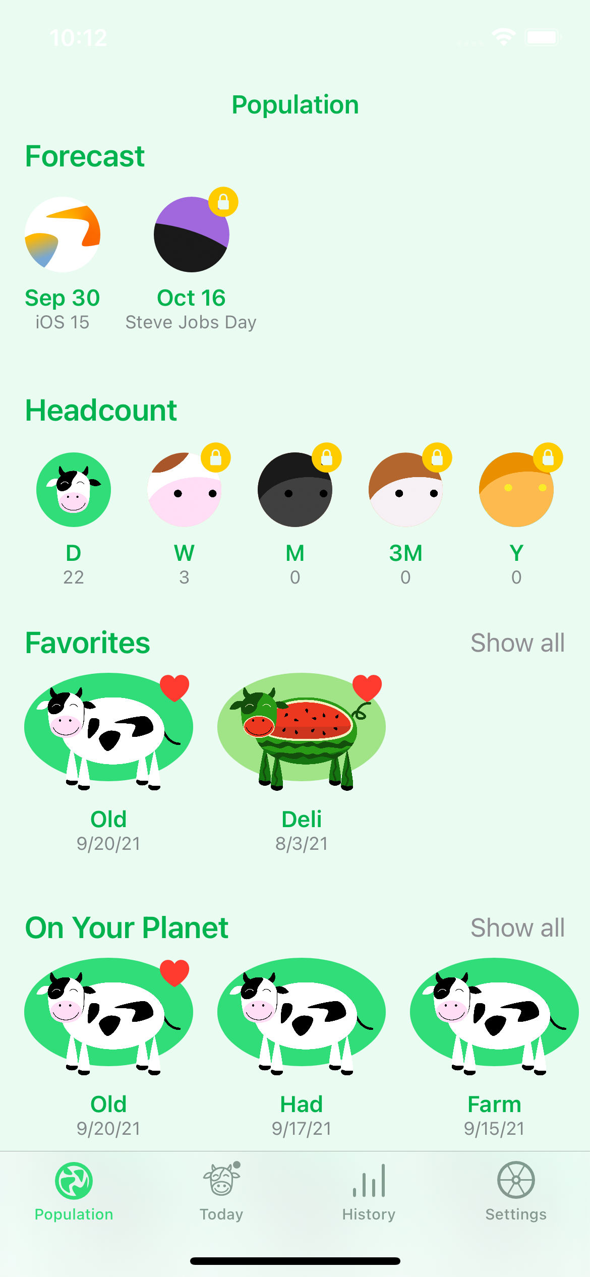
I started with the same basic sections I already had:
- your favorite cows
- the cows currently showing on your planet
- all the cows you have
- the cows that got scared away
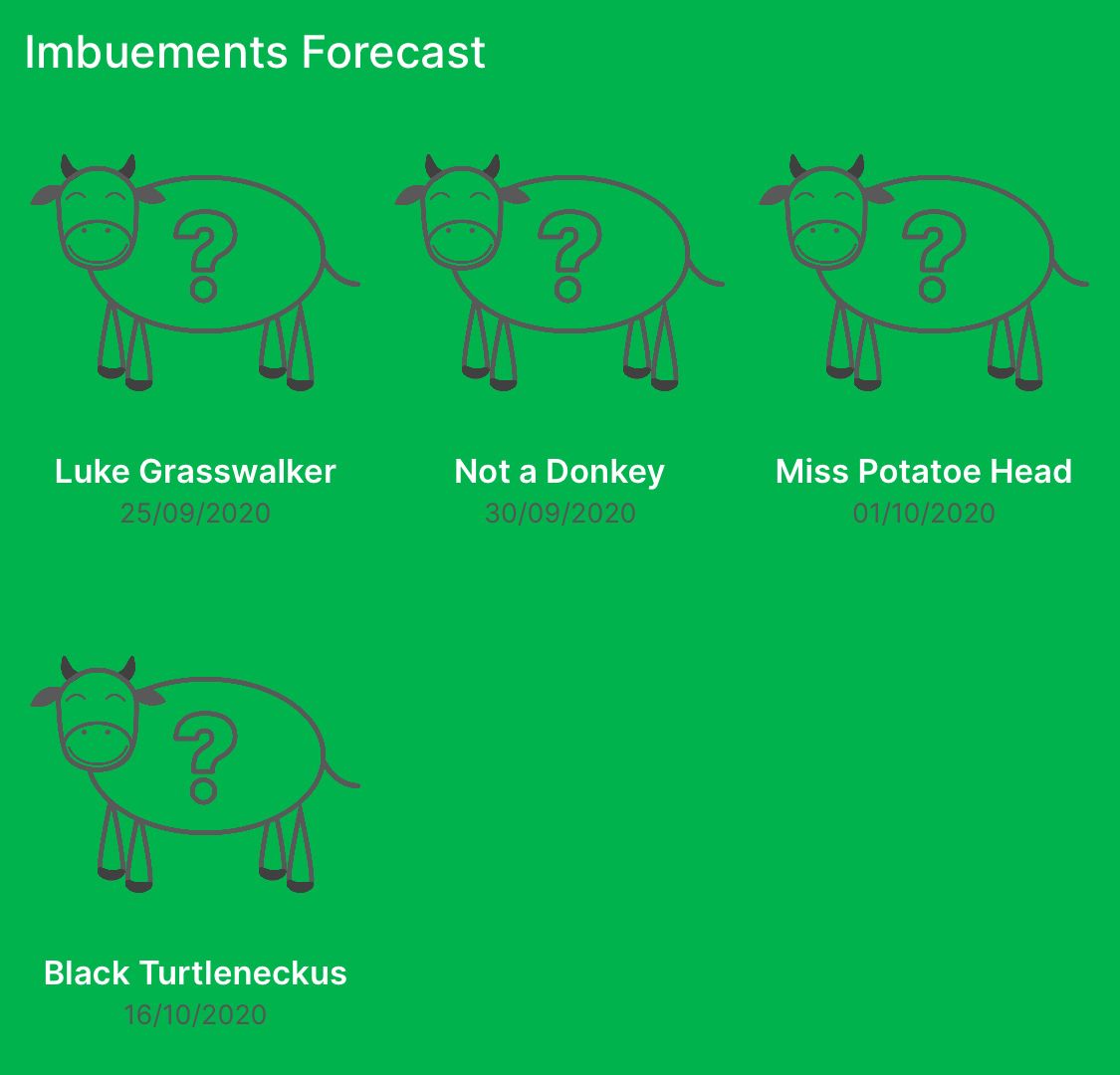
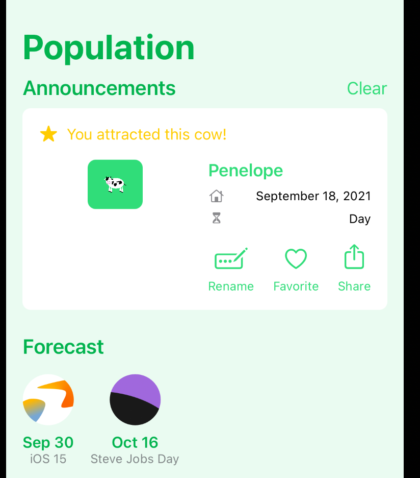
Forecast
Once this was done, I wanted to refresh something I was really ashamed of: the one announcing upcoming special days/cows.
Until now, I had this placeholder ”?” cow, and I thought it was doing a poor job at motivating people to unlock the cow that day.
Having iterated on ways to tease cows on social media, I thought close-up shots would look nice, and so I had this idea of floating bubbles, which kind of makes sense since cows get their powers from what’s in the air.
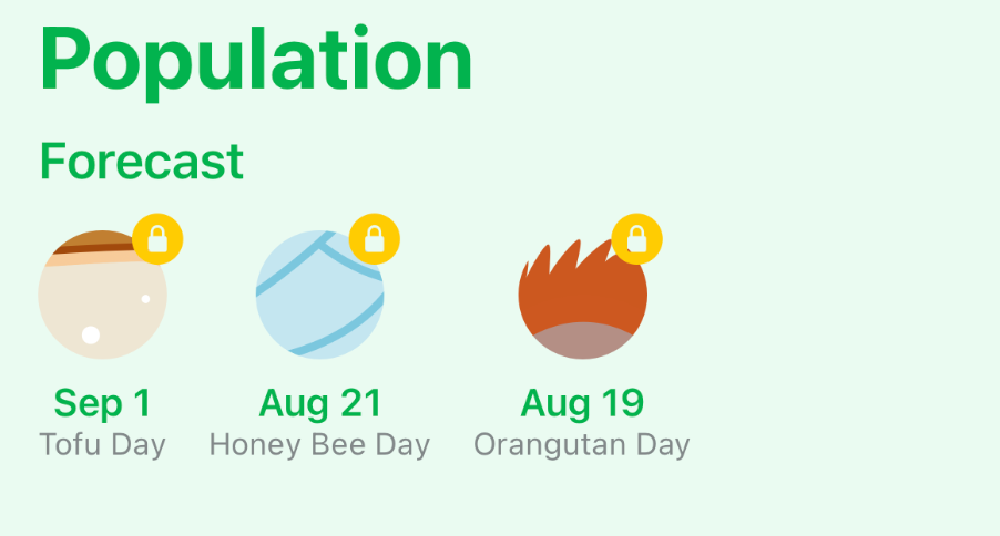
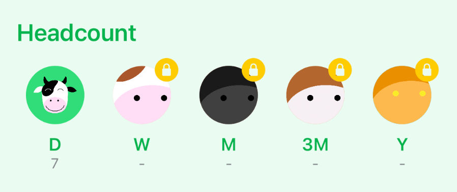
Headcount
When you start to have many cows, they begin to merge, which serves two purposes:
- you get a new cow design and a recognition of your achievement
- there are fewer cows on your planet, which is not that big.
So 7 daily cows will turn into 1 weekly cow, and so on and so forth.
Until now, this was kind of a surprise, but I made it too hard to discover. You really had to use the app for long enough to see that there was more content ahead.
At the same time, I had many cows and it was impossible to tell how many cows of each kind I had.
So I added a headcount which also serves as a teaser. As you can guess, the bubbles turn into cows’ portraits when you reach them.
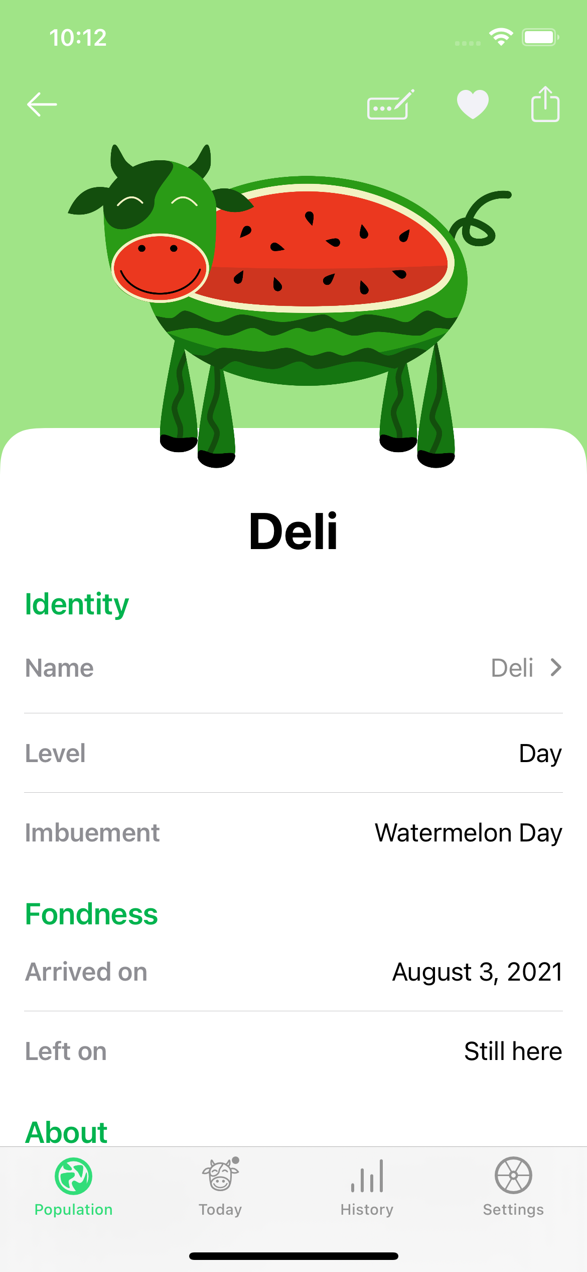
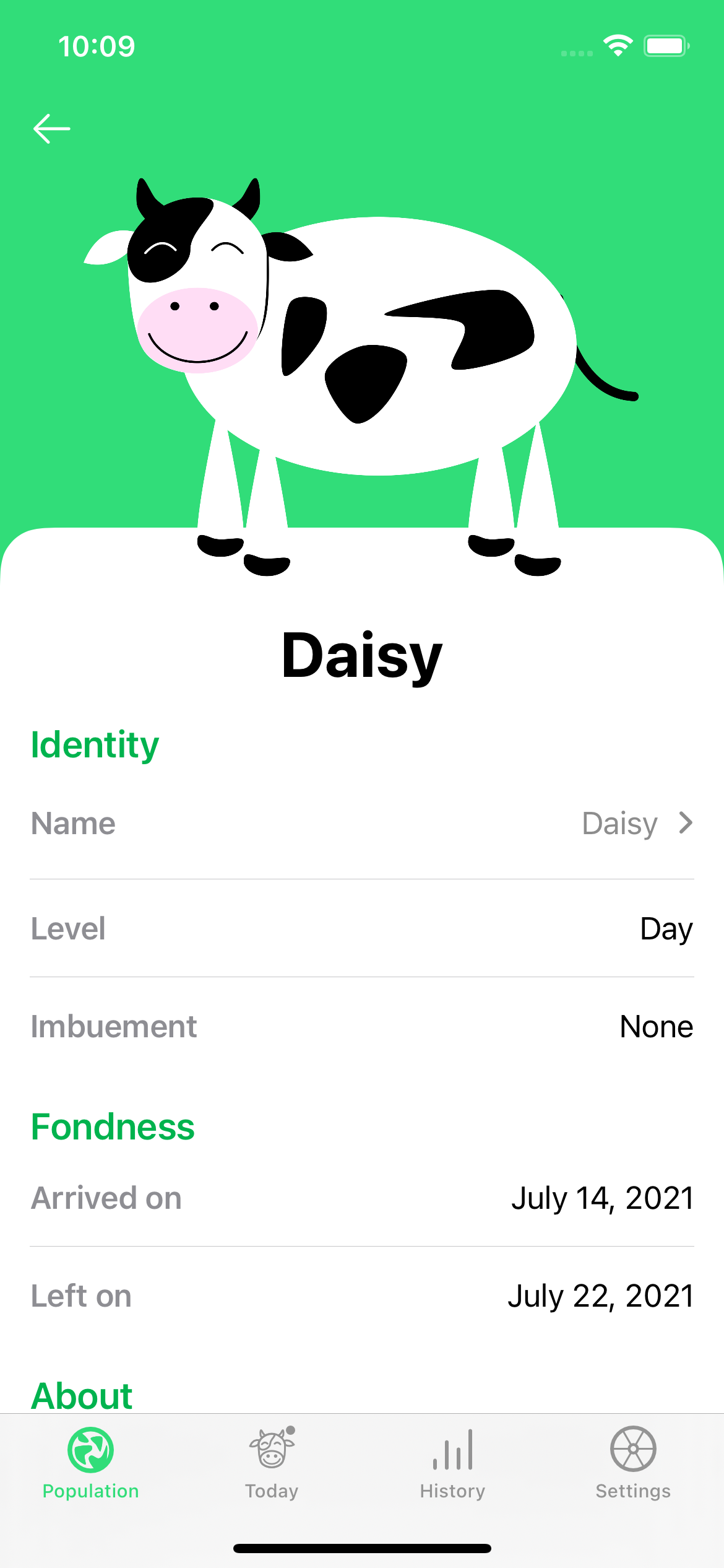
Detail view
Now that I had various lists of cows, I still needed to have a detailed view with a close-up shot, and I wanted to make the cow shine.
Each cow already kind of had their own color but I wasn’t using that in the app. With the new design, that background color would also be used in the lists, it made total sense. I just had to tweak some colors to make sure the contrast would be fine.
Announcements
This is was the last thing I worked on: a way to quickly see and interact with the latest cows you attracted.
It required a bit more work than I’d anticipated getting the icons to be vertically aligned, or just to get the design to work on iOS 14.x (picture on the right, 48h before launch…).
As you can see, I reused the cows’ colors there as well for their name and quick actions.
Notifications
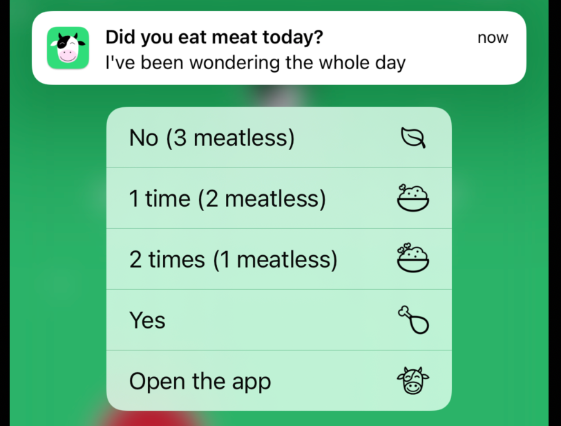
On top of supporting the new iOS 15 interruption levels, I discovered that you could associate icons with the replies from notifications.
At first, I thought I’d find everything I needed in the SF Symbols, but I didn’t. I wasn’t sure how to represent mixed days (when some meals have meat and others don’t), but I like how it turned out.
Other minor adjustments
Home Screen Quick Actions
Now that I had created icons for the notifications, I wanted to make the most of it, so I welcomed Axel’s suggestion and ran with it.
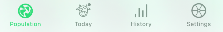
Switched the tabs order
The Settings used to be on the left (where Population is now) because I wanted Today and History to be easily accessible.
Indeed, when you use the app daily, you want to be able to easily reach two things:
- History: to decide if you should pick a plant-based meal today
- Today: to log what you ate
When you hold your phone in the right hand, the first tab is hard to reach, so at the time I thought I’d put the Settings there since you don’t have to visit it so often. But putting the Settings in the first position gave it more importance than it should have.
So I reordered the tabs. The Settings are where you would expect them to be, and it’s fine that the Population is a little bit harder to reach since this is something you’ll check when you have time.
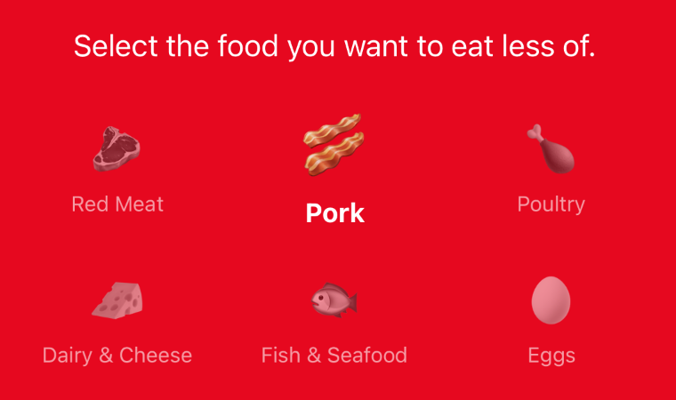
Added pork to the definition of meat
Until now, I considered that “Pork” was a subset of “Red Meat”, but its carbon footprint is 2 to 3 times lower than Beef, so I thought it was worth separating it for people who are just getting started and want to hold on to their bacon & eggs breakfast.
Anonymous contact
I added a @typeform to contact me anonymously, I understand people not wanting to reveal their email when contacting me.September 22, 2021 · View on X
It’s been out for 48h and someone already used it to report a typo.
I love this. pic.twitter.com/wAhCzfAX9G
Frequently Asked Questions
This is just a single button in the Settings, but that Notion page took a lot of time to write! I hope it’s helpful and fun to read.
Thanks for reading!
That’s it for the most visible changes, but there’s a lot more done under the hood that prepares for the next big updates.
I had a lot of fun working on this, but I also thought a couple of times that I’d never see the end of it. It took so long that for the first time, I was publishing updates to the version on the store (3.x) while working on this update.
I hope you’ll enjoy this new No Meat Today as much as I do, and that it’ll help you reach your goals.
Say hi to your cows!
Arnaud